
Welcome back to our fourth and final installment of our series! In this post, we will be discussing single and multiple linear regression, so let’s jump right into it.
Making Predictions Using Single Linear Regression

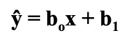
Linear regression is a statistical modeling tool that we can use to predict one variable using another. This is a particularly useful tool for predictive modeling and forecasting, providing excellent insight on present data and predicting data in the future. The goal of linear regression is to create a line of best fit that can predict the dependent variable with an independent variable while minimizing the squared error. That was a pretty technical explanation, so let’s simplify. We are trying to find a line that we can use to predict one variable by using another, all while minimizing error in this prediction. In order for this line to be helpful, we need to find the equation of the line which is as following:
- ŷ → the predicted dependent variable
 → the slope of the line
 - x → the independent variable aka the variable we are using to predict y
 → the intercept of the line
This equation may look familiar, and it should. It is the same equation as your standard y= mx + b that you learned back in Algebra I, just written a little differently in statistics language.
Some of these concepts are difficult to understand on their own, so let’s apply them to our example housing data set to see them in action.
When we calculated correlation, we found a pretty strong correlation between the size of the living room and the price. Now that we know that there is something going on between those variables, we want to see if the living room size can be used to predict the price of our house. Before we jump into calculations, we first want to make sure that we can actually use the linear regression methodology; this means we need to check to see if the relationship between our living room size and price is approximately linear.
On the left we have all of our data points scattered, and on the right we have the same graph except the line of best fit that we are trying to find is included as well:
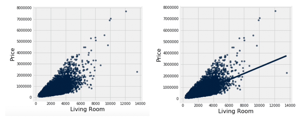
When we scatter our data, we find that the relationship between the living room size and the price is approximately linear, meaning we now have the thumbs up to begin our linear regression.
Testing single linear regression can be done by hand, but it is much easier and quicker to use tools like Excel or Jupyter Notebook to create predictive models. In order to conduct a regression analysis in Excel, you need to make sure that your Analysis ToolPak is activated. How to activate the ToolPak will depend on what version of Excel you are running, so I would recommend just doing a quick Google search on how to set it up. It is fairly simple, so this shouldn’t take any longer than a minute or two. Once it is activated, you are good to go!
Here is a brief outline of how to conduct your regression analysis using Excel:
- Select “Data” tab → Select “Data Analysis” → Select “Regression”
- Input Y Range → select the data for the variable you are trying to predict; dependent variable
- With our example: Price
- Input X Range → select the data for the variable you are using to predict the other variable; independent variable
- With our example: Living room size
- Select the “Labels” box so that your output sheet will include the corresponding data labels
- If you want your regression output to be inserted onto a new worksheet page, check the box for “New Worksheet Ply”
- Check the boxes that say “Residuals” and “Residual Plots;” this will be important later on in our analysis and conclusions
When you press enter, you will be directed to a new workbook sheet that will have a bunch of output tables that may seem overwhelming and confusing, but don’t worry! We are going to show you which numbers are actually important for you to look at.
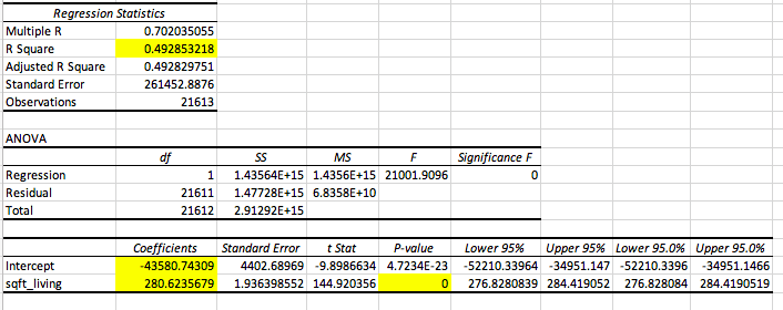
We have highlighted all of the boxes / numbers that are important to look at. Let’s walk through these individually.
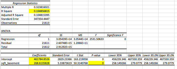
- R Square → the r square value tells us how good our model is at predicting the dependent variable. The closer the number is to 1, the better our model is. With this output, we see our r square value is 0.4949, which means that 49.49% of our data can be explained by our model.
- Intercept Coefficient → the intercept coefficient value tells us our
 value, which is the intercept of the regression line; this tells us that when the square footage of the living room is zero, the price of the house is -$43580.74
- NOTE: The intercept is not always applicable, which is true in our instance since a negative house price is impossible
- Sqft_living Coefficient → this gives us the slope of our line, which is ; the slope tells us as the square footage of the living room increases by one square foot, the price of the home increases by $280.62.
- Sqft_living p-value → this will tell us if the predictor in question, which in our case is the living room size, is a good predictor of our dependent variable. In this instance, with a p-value of approximately zero, we can conclude that the living room size is a good predictor of housing price.
- Note: You can also look at the Significance F value, but if your predictor is statistically significant, the model will be too and vice versa
Now let’s put it all together to create the equation of our line:
Predicted Price = 280.62(living room size) – 43580.74
Now, ideally, given a living room size, we can make a prediction of the price of any given house.
Now that we have built our model, it is important to then look at our residuals, otherwise known as errors. The residual / error, typically denoted as “e,” is essentially how far off our prediction was from the actual price. This is given by the following equation:
e = actual – predicted
If you want to see this written in statistics language, keep reading; if not, go ahead and jump to the next section.
e = y – ŷ
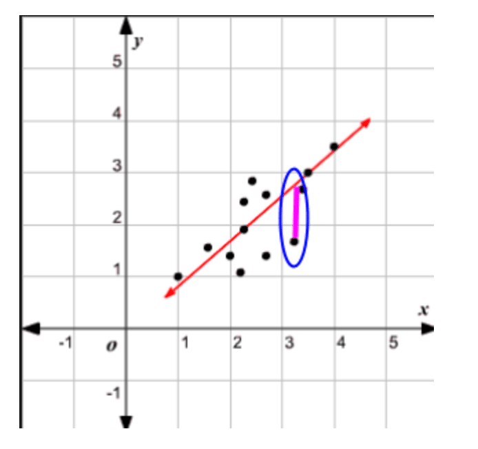
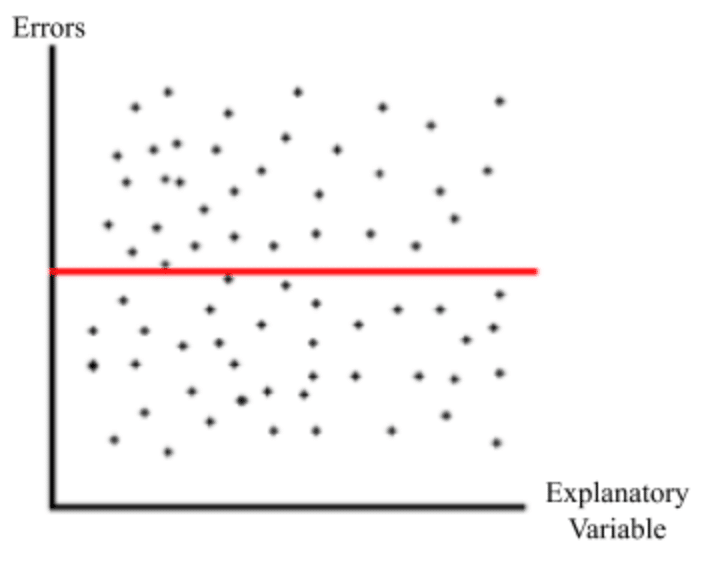
Visually, if the data were to be scattered and the line of best fit laid on top, then the error values would be the distance from the actual observed value to the line at that specific x value, which would be the predicted y value. Here is a visual to help conceptualize this:
When our error is negative, that means that we overestimated the price; when our error is positive, that means we underestimated the price. When our error is zero, that means our predicted price was accurate with the actual housing price given. The smaller the error, the more accurate our prediction is.
When looking at error, we want to ensure that we are equally overestimating and underestimating our data, as well as that errors are occurring randomly. This is why when we are constructing our data analysis we want to include residuals and residual plots. How do we make sure these assumptions are being upheld? Excel will calculate our all of our errors and then scatter them on a graph with the x axis being the independent variable and the y axis being the error value. We will look for the following characteristics on the graph to ensure these assumptions are upheld:
- The data points are scattered evenly around y = 0
- Equally over and underestimating the dependent variable
- The residual plot follows no pattern
- Errors are occurring randomly
Here is an example of a residual plot that upholds these assumptions relatively well:
Here is the residual plot for our single linear regression analysis with living room size:
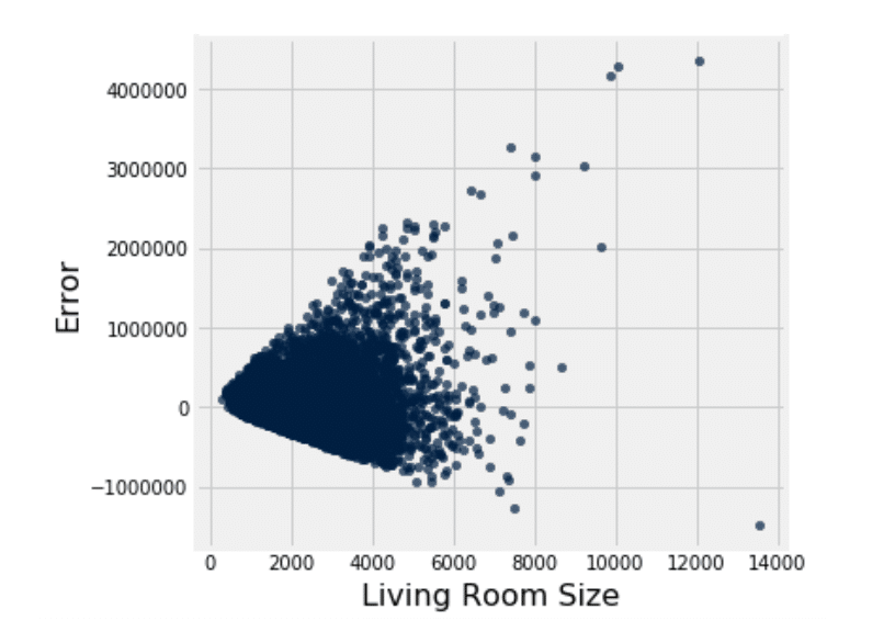
Looking at the plot, we can see the residuals are approximately scattered around zero, meaning we are equally over and under estimating the price. However, we do notice a pattern, meaning the errors are not necessarily occurring randomly. Looking at the graph, we notice a horn shaped pattern, meaning that as the living room size increases, so does the error. This indicates a heteroscedasticity problem, which is a much simpler concept than the word is to pronounce. All this means is that the residuals are occurring unevenly, resulting in the pattern we see above. In order to uphold the regression assumptions, we would want to see a pattern of homoscedasticity, meaning that the residuals are occurring evenly throughout. This breach of the assumption is very important to note, because that means that the living room size may not be a good candidate for predicting house size. This means we should look more into other predictors and find a better candidate. Let’s take a look at the basement size.
Here we see that the that the p-value for basement size as a predictor and the F value for the model are both zero, meaning that the model is a good predictor of price. Moving to the r square value, we find that it is less than that of the living room model; this means that the model with the basement size explains much less data than that of the living room size. However, the issue that we came across with living room size lied in the residual plot, so let’s take a look at that.
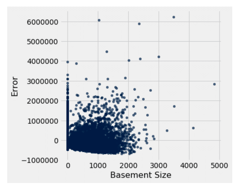
We first notice that the residuals are evenly scattered around zero. Then we notice that, unlike the living room size residual, there is no apparent pattern in the plot. This means that there is homoscedasticity and therefore is a better candidate for predicting price than the living room size is.
Once again, this process is easily repeatable due to tools such as Excel. We have gone ahead and tested the remaining viable predictors and created a comprehensive table of our findings:
| PREDICTOR | STATISTICALLY SIGNIFICANT? (Y/N) | RESIDUAL PLOT |
| Living Room Size (in sqft) | Yes | 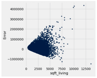
Heteroscedastic |
| Living Room Size 2015 | Yes | 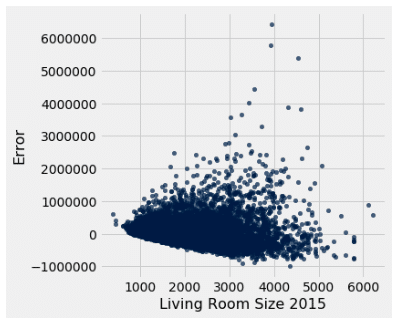
Homoscedastic |
| Basement (in sqft) | Yes | 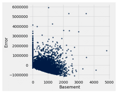
Homoscedastic |
| Lot Size (in sqft) | Yes | 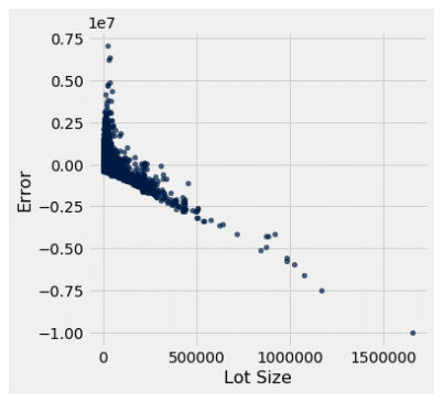
Heteroscedastic |
| Lot Size in 2015 | Yes | 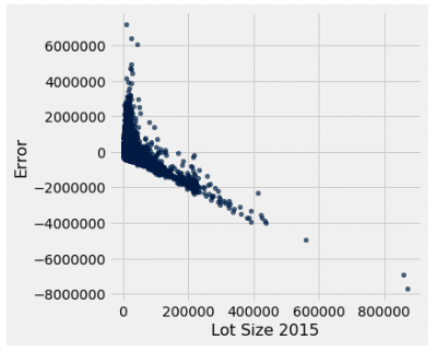
Heteroscedastic |
| Square footage of the house above ground | Yes | 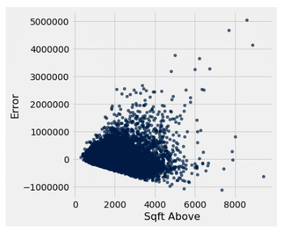
Heteroscedastic |
Of the single predictor models, we can see that the basement model and the living room size in 2015 model uphold the assumptions the best out of all of the other predictors. However, it should be noted that both r square values were modest, so we need to see if there is a better model out there. We know that one variable likely is not able to be the soul predictor of housing price, so what if we combine multiple predictors into one model? That is where multiple regression comes in.
More Predictive Modeling with Multiple Linear Regression
We are going to build off of single linear regression, so if you are still confused about that, it may be beneficial to go back through and review the previous section until you feel you comfortable with the concepts. If you are good to go, then let’s venture on to multiple linear regression!
Multiple linear regression is very similar to single linear regression except it is a little bit more complex. Instead of looking at just one predictor, we are now going to incorporate multiple predictors into our model to see how good they are at predicting price together. So with our example, instead of looking at just one predictor of housing price at a time, we can create one model that incorporates all of our different predictors to see if we can better approximate the price.
One of the assumptions for multiple linear regression, just like single linear regression, is that the multivariate regression line is approximately linear. However, unlike our single linear regression line, it is near impossible to confirm whether or not we uphold this assumption since our line cannot be conceptualized on a 2-D plane. This does not pose as a serious obstacle since deviation from the assumption does not impact our results in a major way. However, it is a good rule of thumb to look at each variable’s linearity individually just to ensure that there is nothing that poses as a serious threat to the assumption. When looking at the variables we will be exploring, all of them follow an approximately linear relationship and therefore should uphold our linearity assumption for the multivariate model.
Once again we will be using the Analysis TookPak in Excel, so make sure that is good to go once again. Head to the data tab and select data analysis and regression, just like we did with the single linear regression. The only thing that we are going to change here is our “X Input Range” values. Instead of inputting just one predictor, we are going to input all of our different predictors at the same time; so in this instance: the living room size, the lot size, and the square footage of the house above ground level. Make sure you select the “label,” “residual,” and “residual plot” boxes as well. Press enter, and you are good to go.
Since multiple linear regression is more complex than single linear regression, it is fitting that there are a few more numbers that we will have to look at when doing our analysis. We went ahead and highlighted them for you:
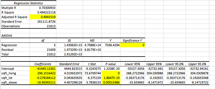
Once again, let’s go through each of these numbers individually:
- Adjusted R Square → As you increase the number of predictors in your model, your r square value will artificially inflate. That is why there is an adjusted r square value that accounts for the increase in the number of predictors to give a deflated and more accurate figure.
- Regression Significance F → This is like a p-value but for our entire model; it will tell us whether or not our model is a good fit for predicting our dependent variable, which in this case is price.
- Intercept Coefficient → Just like in single linear regression, this will tell us the intercept for our model.
- Predictor Coefficients → The remaining coefficients for our different predictors will give us the slopes for each independent variable respectively.
- P-value → This tells us whether or not the variable is good at predicting price given that the other variables are already included in the model.
- Ex: Living room size is a good predictor of price when lot size and the square footage of the house above ground are already included in the model
Now we can put these together to create our equation:
Price = 269.15(living room size) – 0.2782(lot size) – 16.90(sqft above ground) – 41445.124
Now looking at “Significance F,” we see that it is approximately zero. What does this mean? For consistency, let’s keep our significance level, or cut off value, at 0.05. Since our F value is less than our cut off, just like a p-value, we can say that our model is a good fit for our data and for predicting our dependent variable. This is a great tool for comparing different models. For example, let’s say we created another model that had an F value greater than 0.05, then we know it is not a good fit for the data, and therefore we should go with our other model since it statistically proves to be a better fit.
But what if there are multiple models that prove to be significant? How do you pick which one is best? This is where it gets to be a bit more subjective and flexible. To do this, you will have to examine and compare your adjusted r square values. The higher your adjusted r square value is, the better your model is at explaining the data and therefore is a better model for predicting our dependent variable. However, if we increase our predictors and we only see a slight increase in the r square value, it technically is a “better model,” but we can conclude that the additional predictors are not really contributing to the model in a significant way since they don’t help explain that much more of the data.
So let’s say that you drop all variables except for one and you find that your r square value is similar to that of the model that includes all of the possible variables, which will be referred to from here on out as the “extended model.” What does this result mean? This means that with one predictor, you are able to explain approximately the same amount of data as you can with the extended model. And what does that mean? That means that your other variables are mostly just deadweight, not really contributing anything meaningful to your model. Your model with just one variable is able to do just as good of a job as the model with multiple variables. You can then make the model more simplistic and concise by dropping variables that don’t significantly impact the model. This is what makes F testing flexible; you are able to play around with a multitude of different models and see for yourself which variables are significantly impacting your dependent variables and which aren’t.
We played around with some different models and put them into a comprehensive table for you below:
| PREDICTOR(S) | SIGNIFICANCE | ADJUSTED R SQUARE |
| Living room size, lot size, sqft of above ground | Significant | 0.4942 |
| Living room size and lot size | Significant | 0.4938 |
| Living room size and sqft of above ground | Significant | 0.4932 |
| Lot size and sqft of above ground | Significant | 0.3671 |
| Living room size | Significant | 0.4928 |
| Lot Size | Significant | 0.00799 |
| Sqft of above ground | Significant | 0.3667 |
This is a lot of data to digest, so let’s break it down so it is a bit easier to comprehend. We don’t need to bother looking at the significance since all of the tested models proved to be statistically significant. Does that mean that they are all good models? Technically yes, but we can pick the best model by looking at our adjusted r square number. We see that the highest r square value is the model that includes all of our variables; note that from here on out we will be referring to this as the “extended model.” Does that mean the extended model is the best model? Once again, technically yes, but let’s dig a little deeper. We see that our model that only includes the living room size has an r square value that is within hundredths of the extended model. This means that the model with only living room size can explain the same amount of data as the extended model. What can we do with this information? We can conclude that the lot size and square footage of the house above ground level are not really contributing that much since they are not really helping to explain more of the data, so we can drop them from our model and get almost identical results. It can’t hurt per se to use our extended model, but using just the one variable makes our model more concise and easier to work with, leaving less room for errors and complications.
How do we know when adding a predictor to our model is useful? Let’s compare our model that includes only the lot size to our model that includes both lot size and living room size. When we add the living room size to the lot size model, our new model is now able to explain 48.581% more data. That’s a lot! This shows us that adding the living room size to our lot size model is extremely valuable since our r square value, and thus ability to explain the data with our model, has increased drastically. We also see our model be able to explain 12.71% more data when we add living room size to the lot size and square footage of the house above ground model, which is modest but still nonetheless impactful and noteworthy.
Some Parting Thoughts and Comments
Thanks for sticking with us through the series! We hope that you have taken something away from these posts that can help you to better look at and analyze your data. We also hope that we have demonstrated to you that you don’t need to be a data scientist or a statistics expert to turn your data into insight.
For this blog series we ran quite a few numbers and tests in both Excel and Jupyter Notebook, so once again, if you are interested in seeing exactly what went into the calculations and graph / figure creation, follow the links below to be directed to all of the work we did with our data. Within the Excel worksheet you will find lots of data and lots of tests. The first worksheet includes all of the data as well as some relevant information about the set and decoder keys. All subsequent pages are various tests that were conducted and reported throughout this paper. Within the Jupyter Notebook file you will also see the data uploaded from a csv file into the worksheet. Python was then used to create the sample size demonstration and all of the graphs / figures you see throughout. In addition, it demonstrates some alternative methods for calculating correlations, line parameters, and errors that we used to check our numbers with the Excel calculations. These functions that we have defined make calculations and testing highly repeatable, we would recommend using them with your own data set for those of you who are interested in using Jupyter Notebook instead. Do note, however, that the results on both Excel and Jupyter Notebook are identical, and neither is more accurate or beneficial than the other. This is simply just a way to show how you can perform these analyses on either platform depending on your skillset and knowledge.
Link HERE for Excel workbook
Link HERE for Jupyter Notebook file
Part 1 of Series: Click here
Part 2 of Series: Click here
Part 3 of Series: Click here
Microsoft Excel Guide
- =AVERAGE(array)
- Takes the average of the array
- =STDEV.S(array)
- Standard deviation of the sample
- =CORREL(array1, array2)
- Finds the correlation between data array 1 and data array 2
- =Z.DIST(z*, 1)
- Finds the area to the LEFT of the z* value
- Use “Z” when you are working with a population
- =Z.INV(probability)
- Finds the z* value for the corresponding probability value
- =T.DIST(t*, df, 1)
- Finds the area to the LEFT of the t* value
- Use “T” when you are working with a sample
- =T.INV(probability, df)
- Finds the t* value for corresponding probability value
A Note About the T.INV and Z.INV Functions
We used these functions to find t* and z* multipliers for confidence levels / intervals. When we conducted a confidence interval at 95% confidence, we did not input 0.95 into the T.INV or Z.INV function, but rather 0.975. Here is an explanation as to how to find what value to input into these functions:
The figure below exhibits the task at hand when finding a t* or z* value at a certain confidence level. The blue area represents our confidence level, which is also a probability value. What we want to do is find the t* or z* value that corresponds with this probability value, as represented by the red circle.
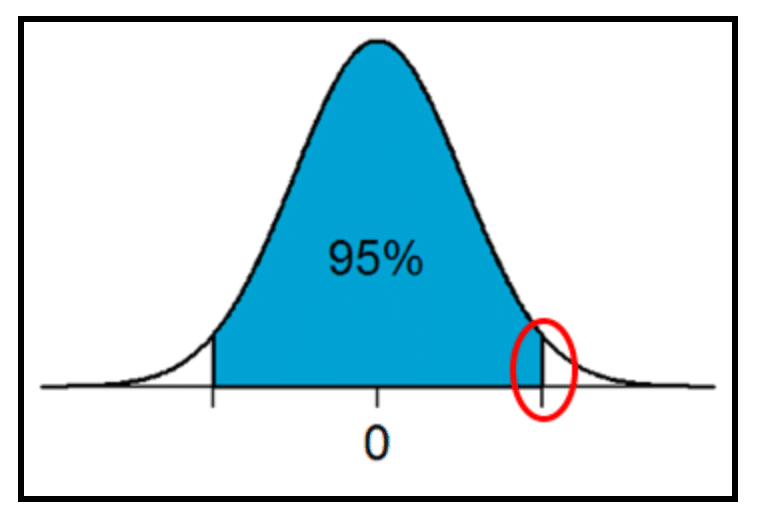
In this example, we are finding a 95% confidence level, and therefore are looking at a probability value of 0.95. When using the T.INV or Z.INV function, we need to use ALL of the area to the left of the t* or z* value that we are trying to find; that means that we need to find the remaining area under the curve.
We know that the area under the curve must total 1, so therefore the remaining area much equal 5 (1-0.95). We also know that since we are working with a normal distribution, the curve is perfectly symmetrical. This means that the remaining area on either tail of the curve are equal. If the remaining two sections must equal 5 (0.05) and there are two tails, we know that each area must be 2.5 (5 / 2 = 2.5 or 0.05 / 2 = 0.025). Now we know that the left tail of the curve must be added to the 0.95 to find the cumulative area the the left of our multiplier, leaving us with 0.975 (0.95 + 0.025). The 0.975 value will be what we input into our Excel function to find the multiplier value.
As you conduct these tests more frequently, you will naturally memorize what value to input into your functions at different confidence levels. However, it may be difficult at first, so we recommend drawing out the curve, the area, and the multiplier you are finding to help visualize exactly what is being calculated and needs to be inputted.