Welcome back! We’re glad you made it to Part 2 of this series. Let’s dive right in.
 One of the most important statistical concepts is the distribution curve. A distribution curve is a graph that shows the different frequencies of a certain variable. For example, if I were to make a distribution curve of scores received on a test, the graph would show how many people received each score. The area under the distribution curve is the probability that you see a particular instance occur. Going back to our previous example, if I wanted to find the probability of a student receiving a score between 80 and 90, I would find the area under the curve in-between those two test scores. The total area under the curve is equal to 1. These concepts will be important later when discussing more about p-value in hypothesis testing.
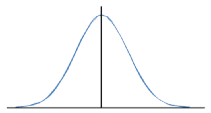
In later posts we will frequently be referring to a specific type of distribution called a normal distribution, often referred to as a bell curve. It is referred to as a “bell curve” because it simply looks like a bell! A normal distribution curve is special because it is perfectly symmetrical.
Sample size actually plays a large role in distribution, especially normal distribution. First, let’s give sample size a brief definition: the number of data points or subjects in your sample, typically denoted as “n.” Another way to think about it is simply how much data you have. For example, if you conducted a survey of 50 students in a high school, your sample size would be 50. The larger the sample size, the more normal your distribution becomes as posited by the Central Limit Theorem. Since many variables are naturally distributed normally, the more normal your sample distribution becomes, the better it is at approximating population parameters. This is easier to conceptualize if you can actually see if for yourself. Below we have put together a demonstration that shows how increasing the sample size causes the distribution curve to be more normal.
For this demonstration, let’s use our example data set and look at the living room size. Let’s assume that the true population size is 21,613. We began by randomly drawing a sample of x number of living room sizes from the population and then graphed the sampled data in the form of a histogram to show the distribution. Note that the x axis represents the living room size in square feet, and the y axis represents the frequency in which it occurs.
| SAMPLE SIZE | DISTRIBUTION CURVE |
| With 100 randomly selected sample data, our distribution curve has a wide spread and does not resemble a normal distribution curve at all. This indicates that a sample size of 100 is inadequate. | 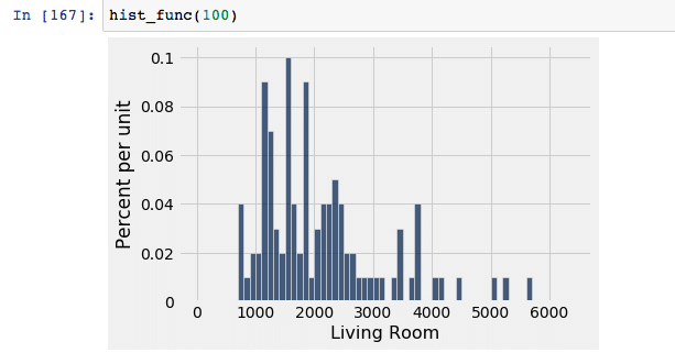 |
| With 500 randomly selected sample data, the distribution curve has decreased spread and begins to look more normal than that sample of 100. This is a better candidate than the sample of 100, but we can still get a better model by using more data points. | 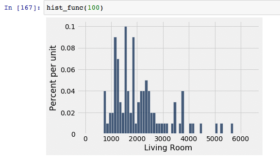 |
| With 1,000 randomly selected sample data, the data decreases its spread once again, as well as becomes approximately more normal. This is a better candidate than a sample of 500, but can become more normal with more data points. | 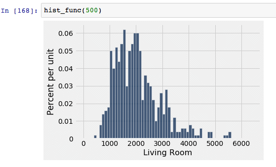 |
| With 10,000 randomly selected sample data, this is where we see a normal distribution curve begin to truly emerge. Since the spread is decreasing, we know that the number of outliers is also decreasing. | 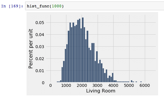 |
| With 20,000 randomly selected data points, the curve looks about the same as the sample of 10,000, except it looks slightly more normal and has slightly less spread. This makes it a better candidate than 10,000 points, but likely only marginally. | 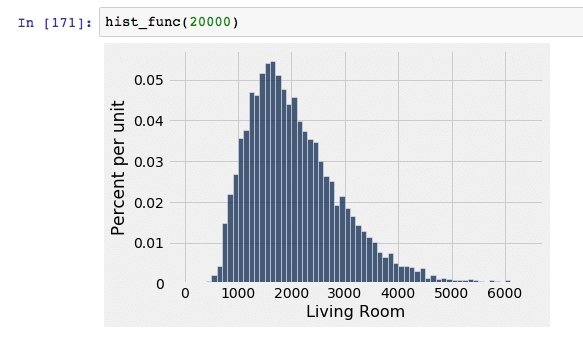 |
| Here is the distribution curve of the “population” of 21613 data points. Obviously, this has the most minimal spread and the most normal distribution. The sample of 20,000 points most closely resembles this curve. | 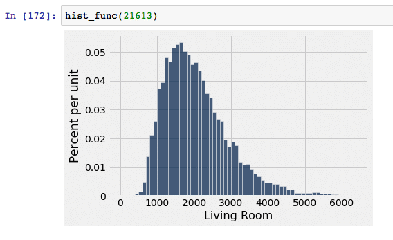 |
As we can see, as our sample size increased, the distribution curve resembled our population curve more accurately. Once we gathered a sample size of 10,000, an approximately normal distribution curve emerges and improved as we increased the sample size to 20,000. This shows why it is so important to have a large enough sample size if we want to draw valid conclusions about the population from our sample. Something to note, however, is that the sample of 10,000 data points produces a curve that looks very similar to the 20,000 and 21,613 curves; although the 20,000 technically best represents the population, we can say that we will have very similar, if not identical, results when cutting that sample size in half to 10,000 since their respective curves are mostly the same. This helps to save both time and resources since you will have to collect significantly less data.
More broadly, it also shows us why we do not necessarily need to use the full population if we want to accurately answer our questions. Why would I spend all of the time and money collecting 21,613 data points, when I could find the same conclusions with only, say, 10,000 data points? This is exactly why we use sample sizes and not populations for statistical exploration. As long as is is large enough, we can use a sample size that will accurately represent our target population.
But how do we know exactly what our sample size should be, and what is deemed large enough? Obviously we want as large of a sample size as possible, but due to finite time and resources, it may be necessary to simply find the minimum number of subjects required for valid conclusions about the population. Finding this value depends heavily on how accurate you want your results to reflect the population, which will largely be dictated by your margin of error. The smaller your margin of error, the larger your sample size will have to be. After setting a margin of error, you can use the following formulas to calculate the necessary sample size based on the type of method in use:
- If you are looking at the percentage / proportion of a population that contains a certain characteristic:

- p = the estimated percent of the population that contains the attribute in question
- q = p-1 = the estimated percent of the population that does not contain that attribute
- z* = z multiplier
- ex: 95% confidence level → = Z.INV(0.975) = 1.96 (don’t worry, we go through an example of how to do this step later in the section)
- If you are looking at a regression model, this one is a little bit more flexible and subjective
- Green (1991) → n >= 104 + k
- k = number of predictors
- Rule of thumb → 10 subjects for every one predictor
- Green (1991) → n >= 104 + k
Note that if the calculated sample size has decimals, it is standard to round up to the nearest whole number, regardless of the value of the decimal. For example, a calculated sample size of 145.129 would be rounded up to 146, even though traditional rounding rules would indicate not to. Also note that margin of error must be expressed in decimal form when used in the formula. (ex: 5% → 0.05)
These formulas might seem like a foreign language if you’re non-technical, but don’t despair! They’re actually much more simple than they look. You have all of the information, you just need to plug it in and voila! All of the variables that you are plugging in are either numbers you already have or numbers you are determining yourself. If you are still a little bit confused, don’t worry! Before going on to the next section, we will run through an example for you. Let’s set the scene: you are trying to find out what percentage of houses in King County, WA have been renovated, but you are confused about how many houses are necessary to collect data on for accurate results. We will begin by finding each value we need, and then putting it together by plugging the numbers into the formula and finding our sample size. Let’s begin!
- p → we can estimate that approximately 50% (0.5) of the houses have been renovated; this is just an estimate, and does not need to be accurate
- q → 1-p → 1-0.5 = 0.5; we can estimate that approximately 50% (0.5) of the houses have not been renovated; once again, just an estimate, so don’t get too caught up in figuring out this value
- z* → let’s say we decided we want 95% confidence in our results, we would find our z* multiplier by calculating =Z.INV(0.975) in Excel, which gives us 1.96; 95% is a pretty standard confidence level to use
- Refer the Excel Guide for an explanation of why we input 0.975
- Margin of error → let’s say we decide we want our results to be within 3 percentage points of the true population parameters, then our margin of error would be 3%, but would be put in as 0.03 in the formula.
- NOTE: When we set our confidence level and margin of error, we are saying: “We want to have x% confidence that our results are within y percentage points of the true population parameter where x represents the confidence level and y represents the margin of error.”

- n = 1067.11 → round up → 1068 housing points
Missed Part 1 of this blog series? Click here.
Ready for Part 3? Click here.


