A descriptive dashboard essentially answers the question, “What happened?” It provides analytics that describe and summarize past events and trends, such as: who are my highest paying customers, what were the sales over the past month, quarter or year; what was the customer churn during a specific time frame (such as during a major organization shift). The target audience includes executives and upper management who want to look at the bigger picture as well as managers who would like to identify potential areas of concern and to then drill down to diagnose the issue.

So what types of analytics or reports should you build for a descriptive dashboard?
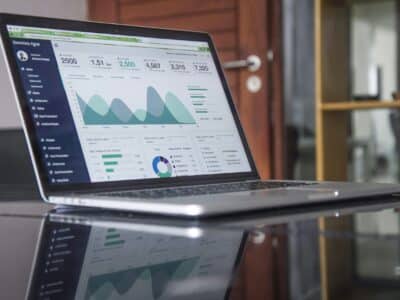
- Key indicators on the top for a quick review. (The main purpose of a dashboard is to provide instant access to information after all.)
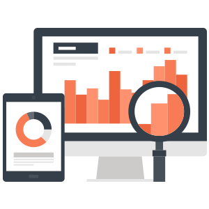
- Supporting high level charts or table summaries that describe the KPIs. If used with numerical KPIs, descriptive data can provide context to help you effectively make quick decisions.
- Charts/tables to show:
• Top N categories
• Trends on a timeline
• Comparison of top categories
So that your descriptive dashboard is most useful, you should consider these important factors when planning and creating your dashboard.
• The right key performance indicators (KPIs) should be identified and displayed. At a quick glance, they should describe the main essence of the dashboard.
• Charts and tables should support those key indicators. They should show how the key indicator values were derived.
• Charts and tables should be small and simple. They should show top/bottom, 5/10. They should not show a list of everything.
• Key filters should be available to filter the high-level data. Also, these filters should apply to the entire dashboard and not individual elements.
• Capability to drill down from the high level data to view details must be available.


